This is such a happy day for me !! Usually, when I move into a new house, I renovate the master bedroom first so I have a place of clean calm to lay my head during the long renovation of the whole house.
This time it was more difficult as the master bedroom needed some renovation that we couldn’t accomplish for many months (so hard to find good contractors with availability during the Covid period). So our bedroom was one of the last rooms we completed in this house.
I’m excited to share some of the “quirks” of this room with you and show you how cozy this bedroom is now!
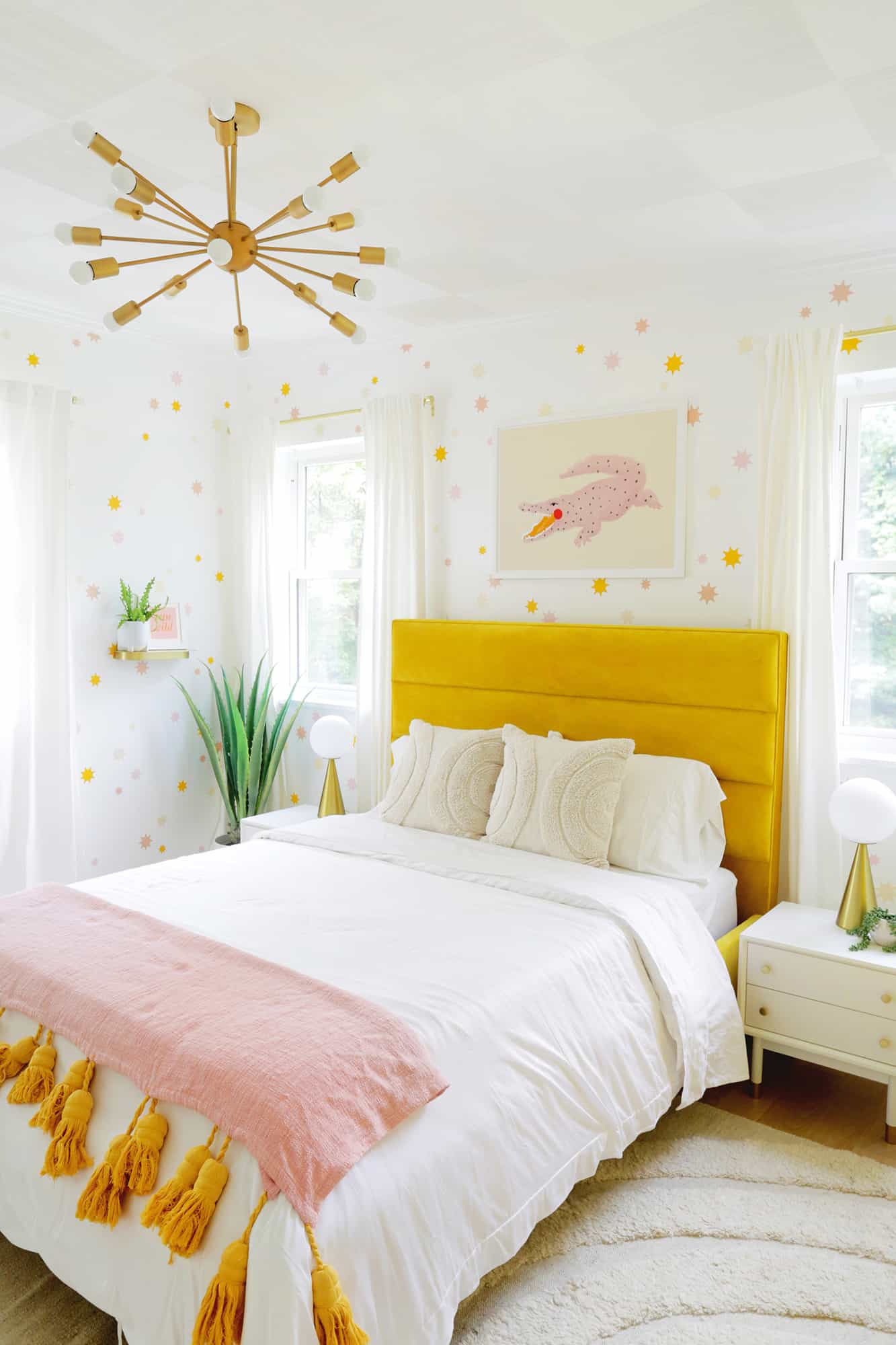
I really wanted to create a space that would feel happy and match the rest of the house’s color scheme (you can see my home mood board here). My daughter’s room right next to us has a really cheerful daisy wallpaper, so the goal was also to keep up with the good vibes that her room exudes as well.
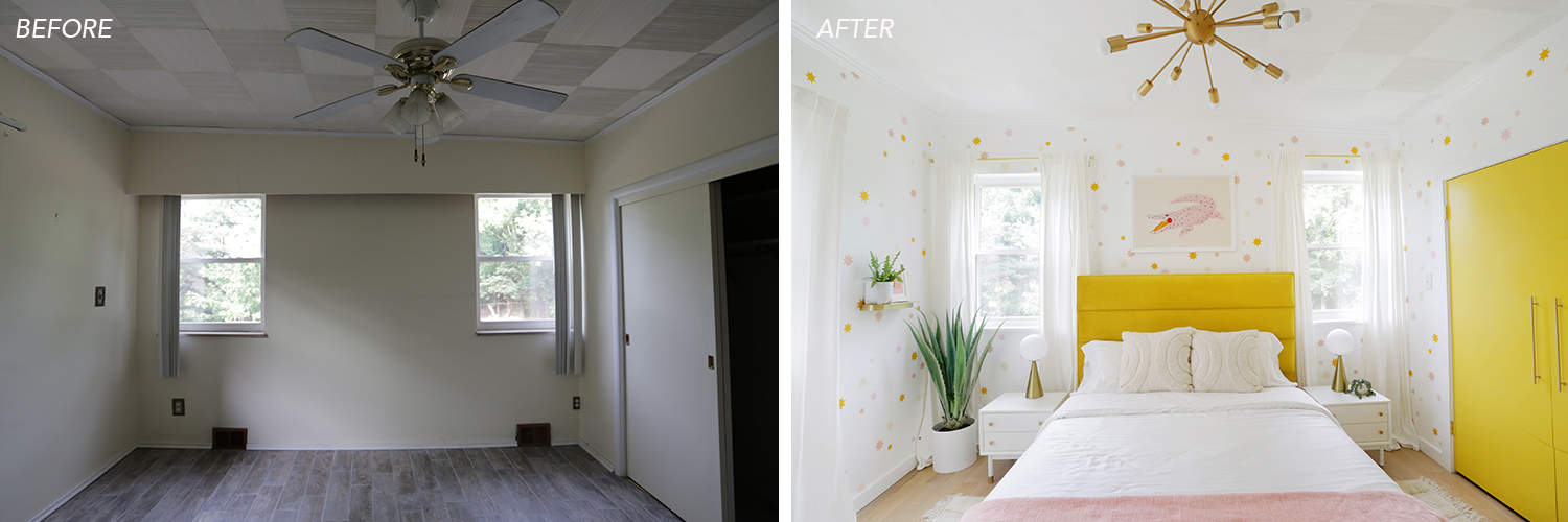
We also fixed the vintage combed plywood ceiling panels in the room (you can read more about it here) and the ceiling fix really helped give the room a makeover. You can also see that an old-school wooden valance was built over the bed wall with fluorescent lights in it so you know that.muss.go.go. Immediately …
Technically, there were three different wall materials that touched the ceiling, and the moldings they had (which is necessary with this type of ceiling tile) were installed pretty poorly. So we took all of that off and put a new crown molding back in, which made such a big difference in getting everything to look finished.
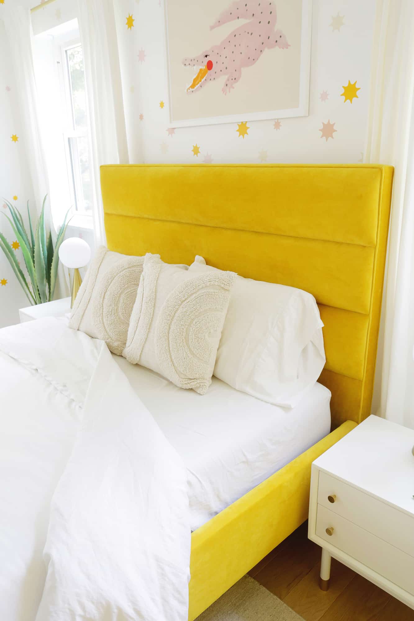
This is also the first time I have new bedroom furniture in over 10 years, if you can believe it. We bought our master bedroom pieces when we were engaged and used them until we moved to this house. We’ve been married 11 years now, so that’s a whole decade of revising and reworking these pieces multiple times, so it was really fun picking something new for this room.
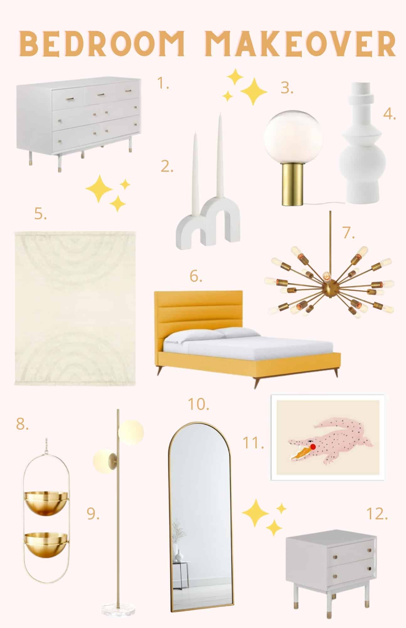
Can we talk about how beautiful this velvet marigold bed frame is? The velvet looks so luscious and the color is such a cheerful mustard yellow that it really sings in the room. The padded headboard is also great for hanging out in bed and reading or watching a show cuddled up with Lola on a Saturday morning.
I also love this pink alligator print above the bed. It’s so whimsical and quirky (similar domed pillows here).
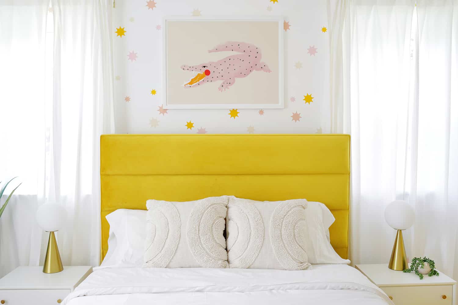
I also love that our bedside tables are nice and low next to our platform bed (really easy to get to from the bed) and I love the gold and white details that are classic with a mid-century nod. Those Globe table lamps are one of my favorite lamps ever. Such a fun 70s vibe, definitely!
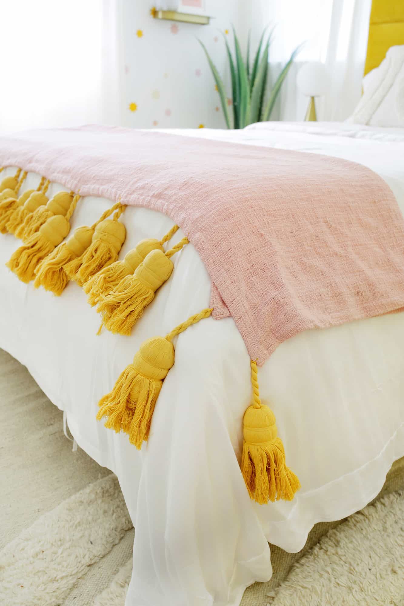
I love these giant tassel blankets (this one is cute too). So much fun!
Can we also briefly talk about cupboards? The previous closet was in dire need of a complete overhaul as the closet system it had installed was shaky and super annoying. And it had a lowered acoustic panel ceiling (yes, like an office) with a light switch in the closet that was really hard to get to.
We put in a drywall ceiling, repaired a lot of plaster damage on the walls, added more interior lighting, moved the switch outside and built a split closet system that not only makes the room better for us overall, but also makes it look like a demo closet in a shop (which I love!).
The old closet also had two huge sliding doors that were only attached at the top (no rail at the bottom) so when you tried to use them they worked like two huge loose teeth. So I found two panels in a junkyard and instead had our contractor adjust them to open like French doors. I painted them and added the circle design to make them more individual.
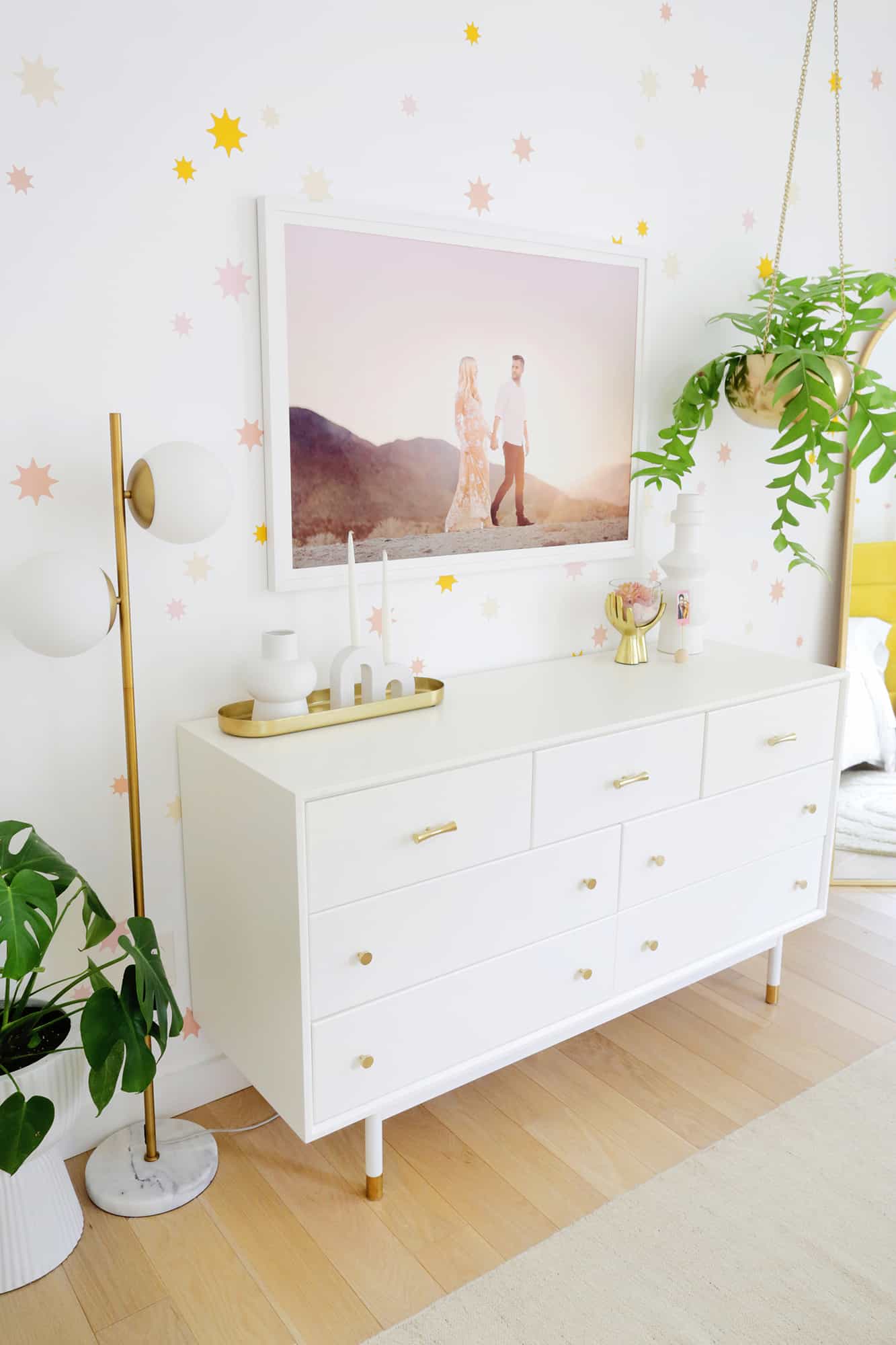
The bedside tables are from the same collection as our dresser, which is so pretty and has the same upscale feel in gold and white. It’s also great size as it isn’t too big for the room but gives us plenty of storage space (so we don’t have to keep everything in our closet).
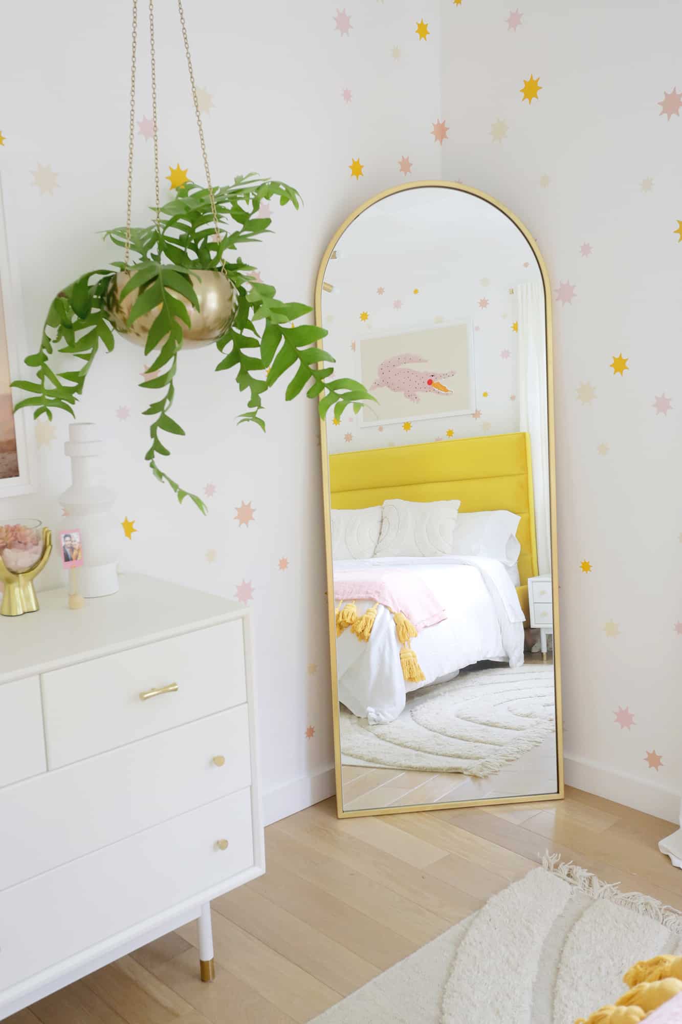
It was a bit of a hassle to find the best spot for a full length mirror in this room, but I realized that a larger floor mirror would fit this corner perfectly, so I got this beauty and I love how it’s in the space .
I added a gold hanging planter next to it to give the zone some green without taking up space.
Our friend Ryan took this photo of Todd and me in Palm Springs during our babymoon almost five years ago and I just got around to printing it out (although it’s been on my to-do list for years). Isn’t it so wonderful !?
I love this tall white vase, bow candle holder, and wooden ball photo holder which is a super easy DIY (similar brass tray here).
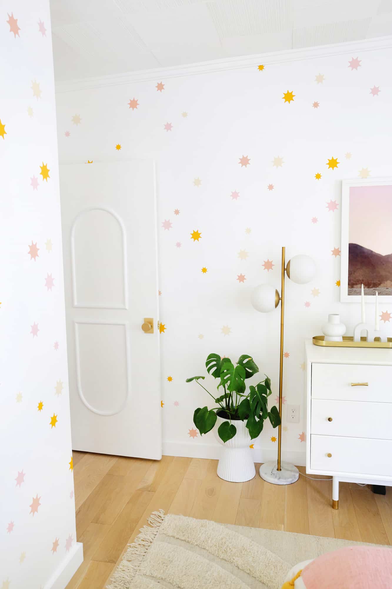
Another big change for the room was removing the gray wood-look tiles that ran across the top floor and replacing them with a white oak floor instead.
Aside from the addition of functionality with the new floor (the old one had a lot of problems because it wasn’t installed properly), it also looks lighter, fresher and generally just more luxurious. It’s one of the best things we’ve done in the whole house.
The downstairs doors also needed some help and a makeover, and I love the doorknobs we chose for the room (a bit more expensive but with a five-year guarantee on the finish) and the addition of the arched moldings to the doors is really a lot It’s a bit of that Parisian vibe that I’m always drawn to.
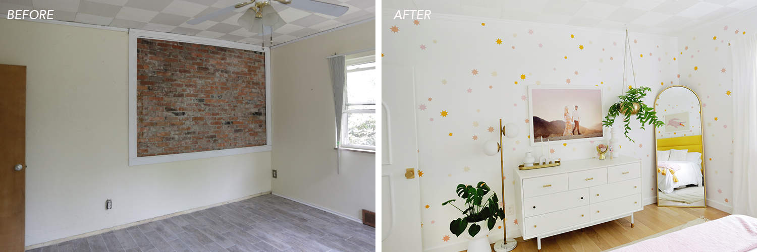
OK, can you see the partially brick wall in the photo above? This area is the back of the fire box for the living room fireplace on the other side of the wall, but for some reason only a rectangular section of the wall is exposed (instead of an entire wall like you might see in a New York loft) or something ). Then this weird area had a makeshift frame around it like it was a work of art or something ???
Also, there was quite a gap between the wall and the frame, so the crumbling edges of the plaster and brick mortar would simply fall onto furniture underneath. So you would have a constant gray dust of sand all over the top of our dresser. Again, I know that exposed brick is a “thing” in some places, but that felt really weird and like an accident, rather on purpose – as if someone wanted to remove all the plaster to have a partial brick wall, but then it became tired and stopped after a few hours.
And then they added a frame. Huh ?? Anyway, we ended up having our contractor build a new wall on top of the textured plaster / brick area so the wall would look smooth and match the rest of the walls in the room, and it feels so much better to have those closed.
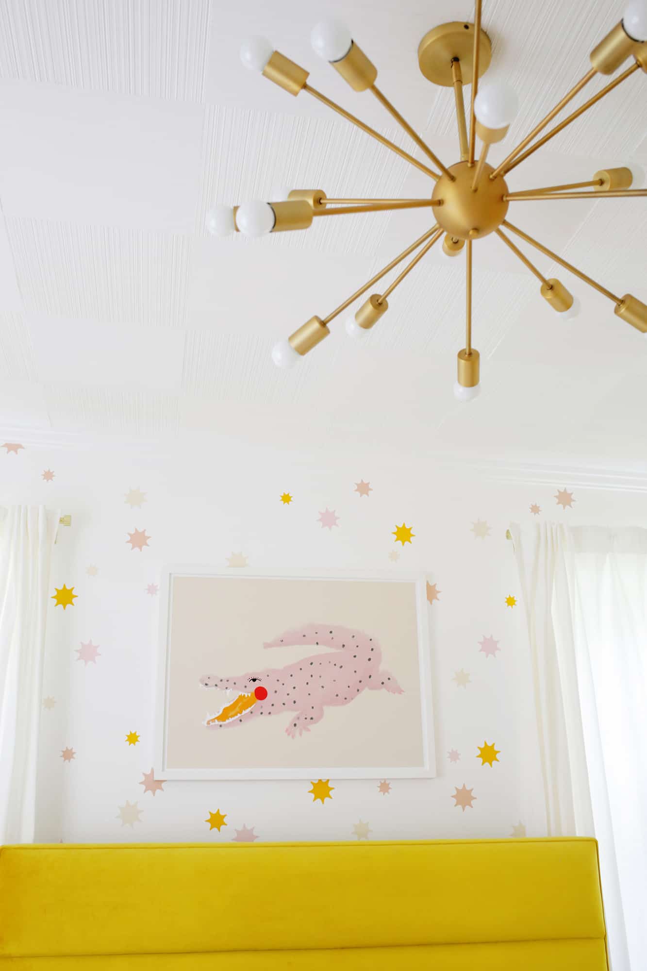
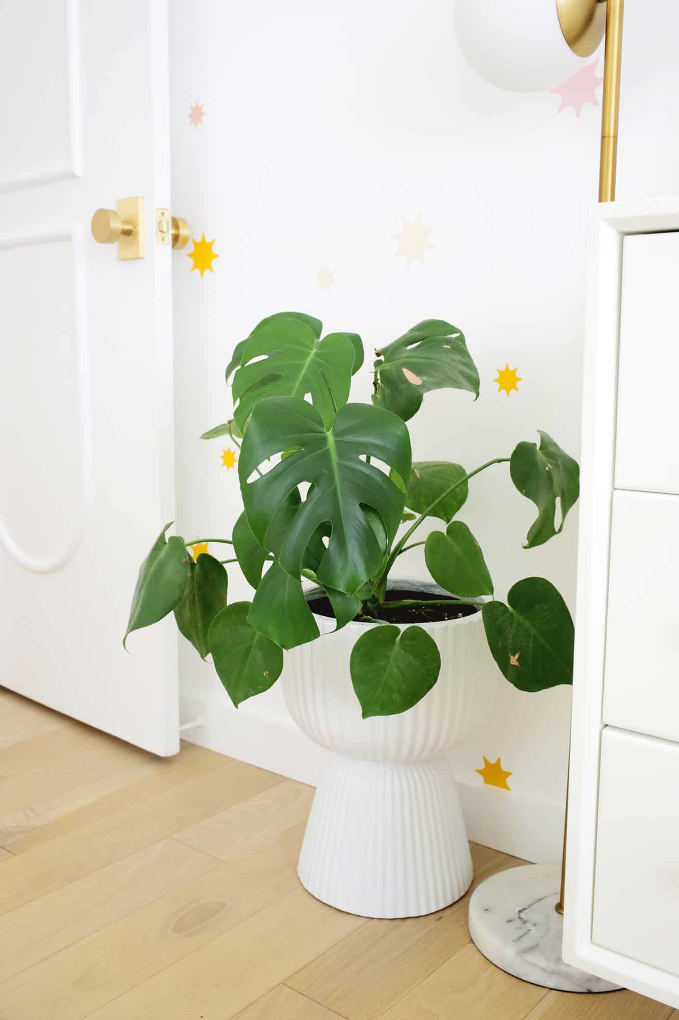
For lighting, we added a classic Sputnik brass chandelier and a vintage-inspired globe floor lamp. I’m a little bit crazy about lighting and need to have it all in a dimmer that I think offers the best options for layering light to suit your mood.
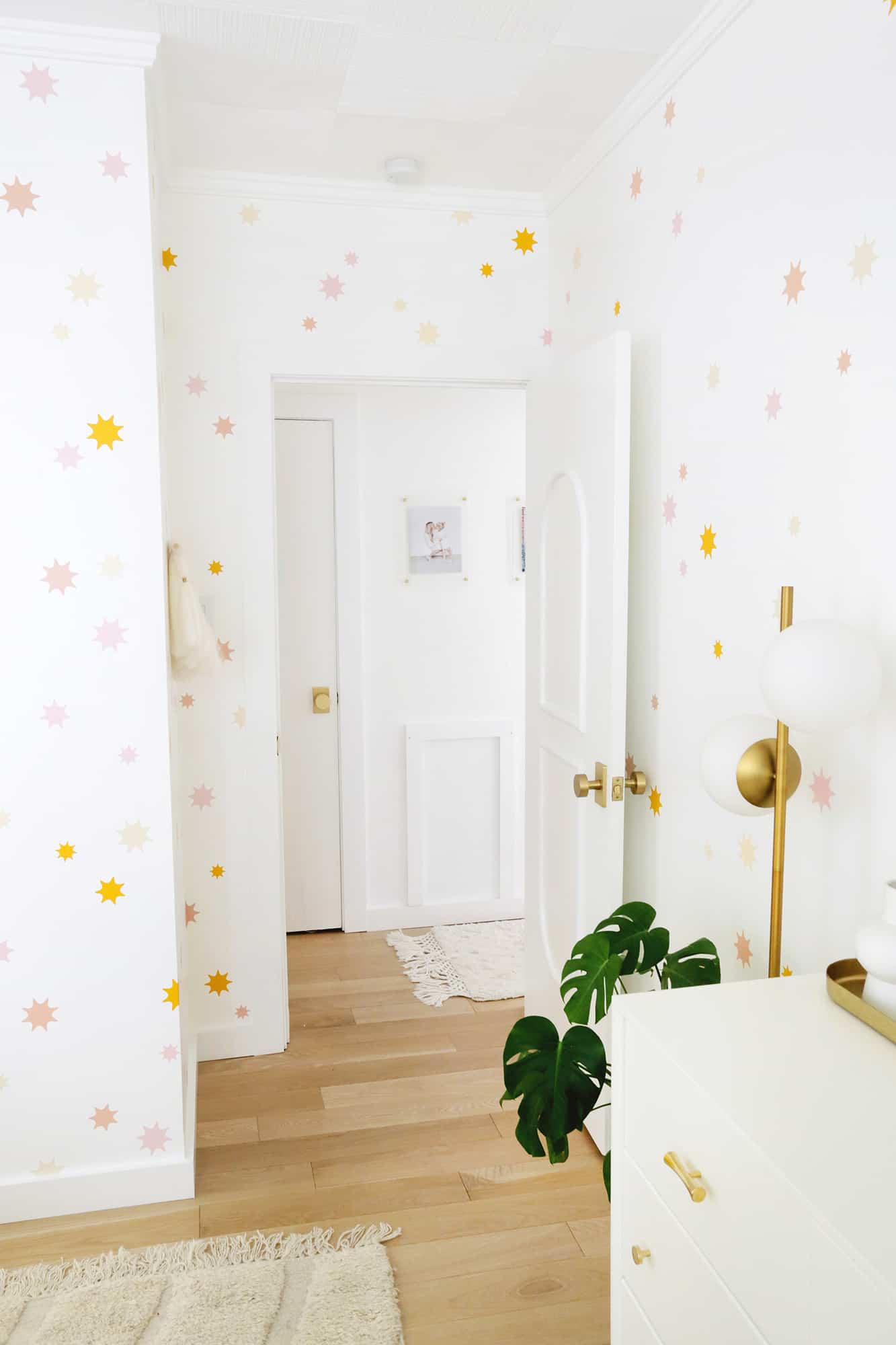
Can you believe the “wallpaper” here are just removable stickers? I made a similar star print for the cave in our last home and kind of missed it here in this house so I changed the pattern a little, rounded the edges to match with more arches, and cut it out in four different colors. It’s such a fun and happy atmosphere.
Would you like to see other rooms in my house? Check out …
I love this rounded brass shelf – it’s the perfect size for a small planter and a cute print to add something special to that corner. And I also love a fluffy wall hanging to add a little coziness to a wall.
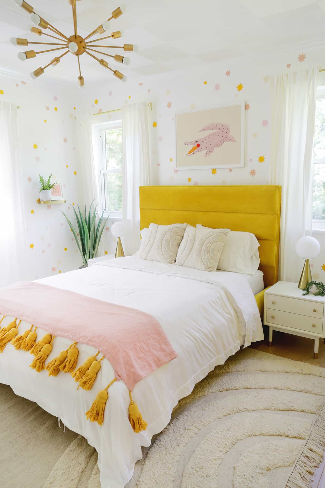
I brought that arched rug from our last home, and I love the way it brightens up the room, makes it extra cozy, and also highlights the arch theme in the room (this is a thinner, more budget-friendly option).
This is definitely one of those rooms that felt like it was never going to be finished, so I’m thrilled to see it finally come! ! It’s really amazing to be sitting in bed facing a finished room instead of a visual to-do list (if it’s clean anyway haha) and I’m so happy to be on the other side of all the mess and work that it took to get to this point.
Hopefully it looks as happy as it feels to be in here! xx. Laura
Love a good before and after bedroom tour? Check out these posts!
Credits // Author and Photography: Laura Gummerman.


